

Key Takeaways
Why placement comes before color
Most people pick a color first and then decide which wall to paint. That order tends to produce disappointing results. Placement determines whether the accent reads as intentional design or an afterthought.
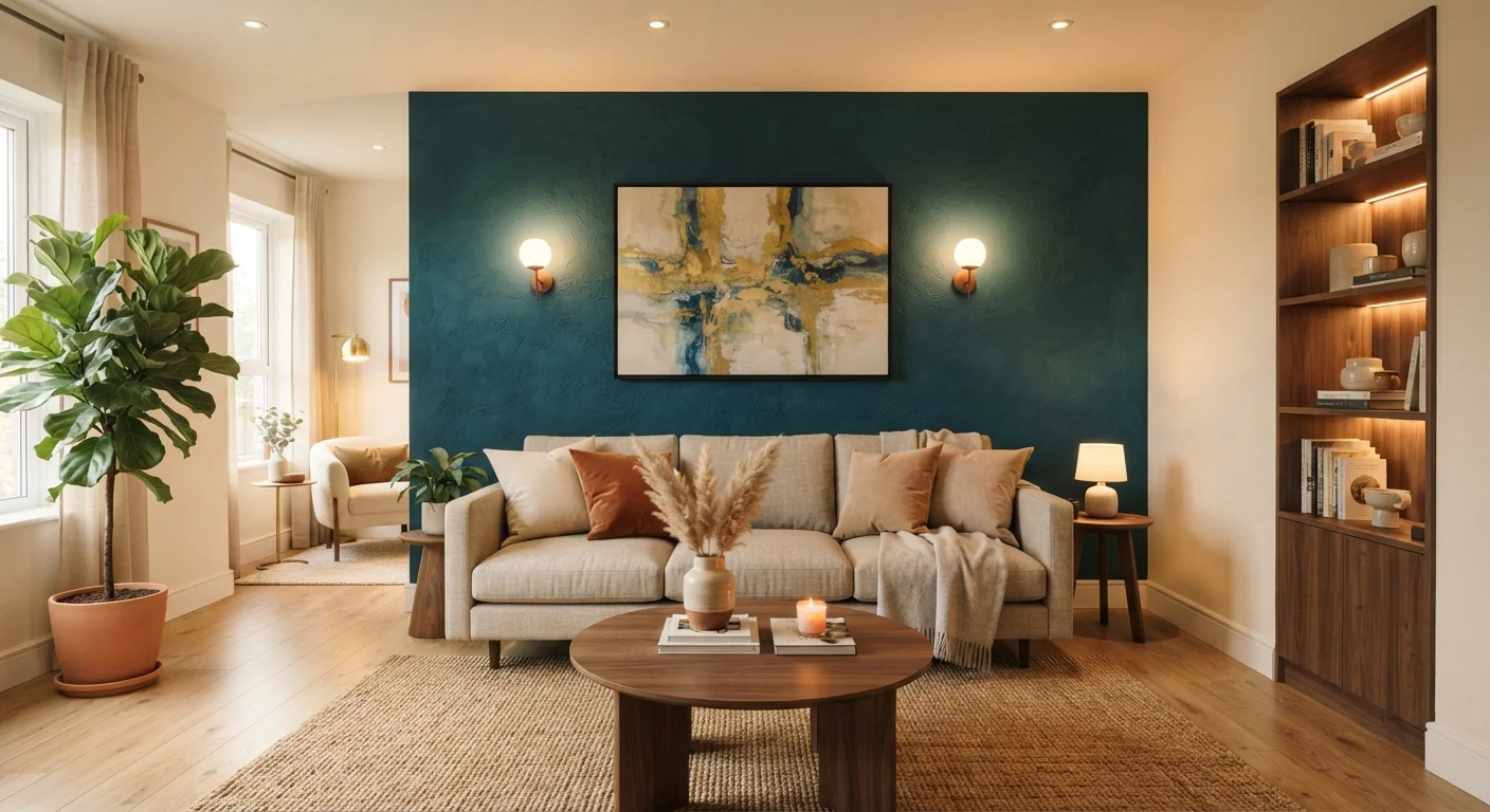
The correct wall to accent is the one a visitor's gaze goes to without prompting. In a living room, that is usually the wall directly opposite the entry. In a bedroom, it is typically the wall the headboard sits against. These are called focal-point walls, and they already carry visual weight. An accent color simply reinforces something the room's layout already communicates.
Walls that hold windows, doors, or heavy built-ins are rarely good candidates. The openings interrupt the surface and fragment the effect. A solid, unbroken wall lets color or texture read cleanly.
Before committing, stand at the room's main entry point and note where your eyes settle. If they move around without landing anywhere, the room may need furniture placement adjusted before you consider paint. Accent walls do not fix layout problems.
Choosing a color that works with the whole room
An accent color should connect to something already in the space: a tone pulled from upholstery, a rug, curtains, or artwork. This creates cohesion rather than a wall that looks applied from outside the room's logic.
Contrast is what makes an accent register. A wall that is only one shade darker than adjacent walls often disappears. However, extreme contrast in rooms under 200 square feet can make the accented wall feel like it is closing in. In smaller spaces, consider a deep hue in the same color family as the surrounding walls rather than a fully opposing color.
Paint manufacturers typically offer fan decks organized by color family, which makes it easier to find shades that share undertones with existing elements. Test any candidate color as a large swatch (at least 12 by 12 inches) on the actual wall surface and observe it at different times of day before committing. Light shifts dramatically between morning and evening, and colors that read as warm at noon can appear quite different under incandescent evening light.
If you are uncertain about color, a useful starting point is understanding what paint sheen and color actually do on a wall, including common assumptions that steer homeowners wrong.
Getting accurate color reads at home
Many hardware stores offer sample-size paint quantities specifically for swatch testing. Painting a piece of white poster board and moving it around the room at different times of day can also help you see how the color responds to your specific light sources before you commit to a full wall.
Using texture instead of or alongside color
Color is not the only tool. Texture creates contrast through shadow and surface variation rather than hue, which can work well in rooms where a bold color would feel out of place.
Common textured approaches include limewash paint, plaster finishes, shiplap boards, reclaimed wood planks, and peel-and-stick panels. Each produces a different visual weight. Limewash and plaster create a soft, layered look suitable for living rooms and bedrooms. Wood planks and boards read as more structured, which fits family rooms and home offices.
Combining texture and color is possible but requires care. A heavily textured surface in a very dark color can absorb so much light that it makes a room feel dim. If you want both, a mid-tone color on a moderately textured surface tends to give the most readable result under typical residential lighting.
Peel-and-stick options have improved considerably and can be removed without wall damage in most cases, though conditions vary by product and wall surface. They are a reasonable choice for renters or anyone who wants a lower-commitment test before a permanent installation.
Proportions and common mistakes
An accent wall should occupy one wall of the room, not two. Running a color around a corner onto a second wall blurs the focal point and removes the contrast that gives the accent its function. The same applies to accent ceilings paired with an accent wall in the same color: unless the room is large and the effect is deliberate, the two surfaces compete.
Ceiling height affects how color reads vertically. In rooms with standard 8-foot ceilings, very dark colors on a full wall can make the space feel compressed. Carrying the accent color only to chair-rail height, or treating the lower two-thirds of the wall while leaving the upper portion in the room's base color, can preserve the effect without the compression.
Furniture placement matters too. If the focal-point wall is largely hidden by a large bookcase or wardrobe, the accent serves little purpose. Either clear enough wall surface to let the color show, or choose a different wall.
Identify the focal-point wall before selecting any color or material.
Starting with placement prevents the common mistake of painting a wall that the room's layout does not support as a focal point. The accent should reinforce what the eye already does naturally.
Test paint color on a large swatch and observe it across at least two full days before committing.
Color shifts under different light sources and at different times of day. A small paint chip viewed in a store gives almost no usable information about how a color will behave across an entire wall.
Connect the accent color to an existing element in the room.
An accent pulled from the room's textiles or artwork ties the wall treatment into the overall space rather than making it feel like a separate decision. This connection is what separates a designed room from a painted room.
Limit texture-plus-color combinations to mid-tones on moderately textured surfaces.
Heavy texture in very dark colors absorbs light and can make a wall look muddy rather than refined. Mid-tones allow the texture's shadow variation to remain visible.
Keep the accent to one unbroken wall surface.
Wrapping color around corners or combining an accent wall with an accent ceiling in the same hue removes the contrast the technique depends on. One clean surface is more effective than multiple interrupted ones.